
OLIVA
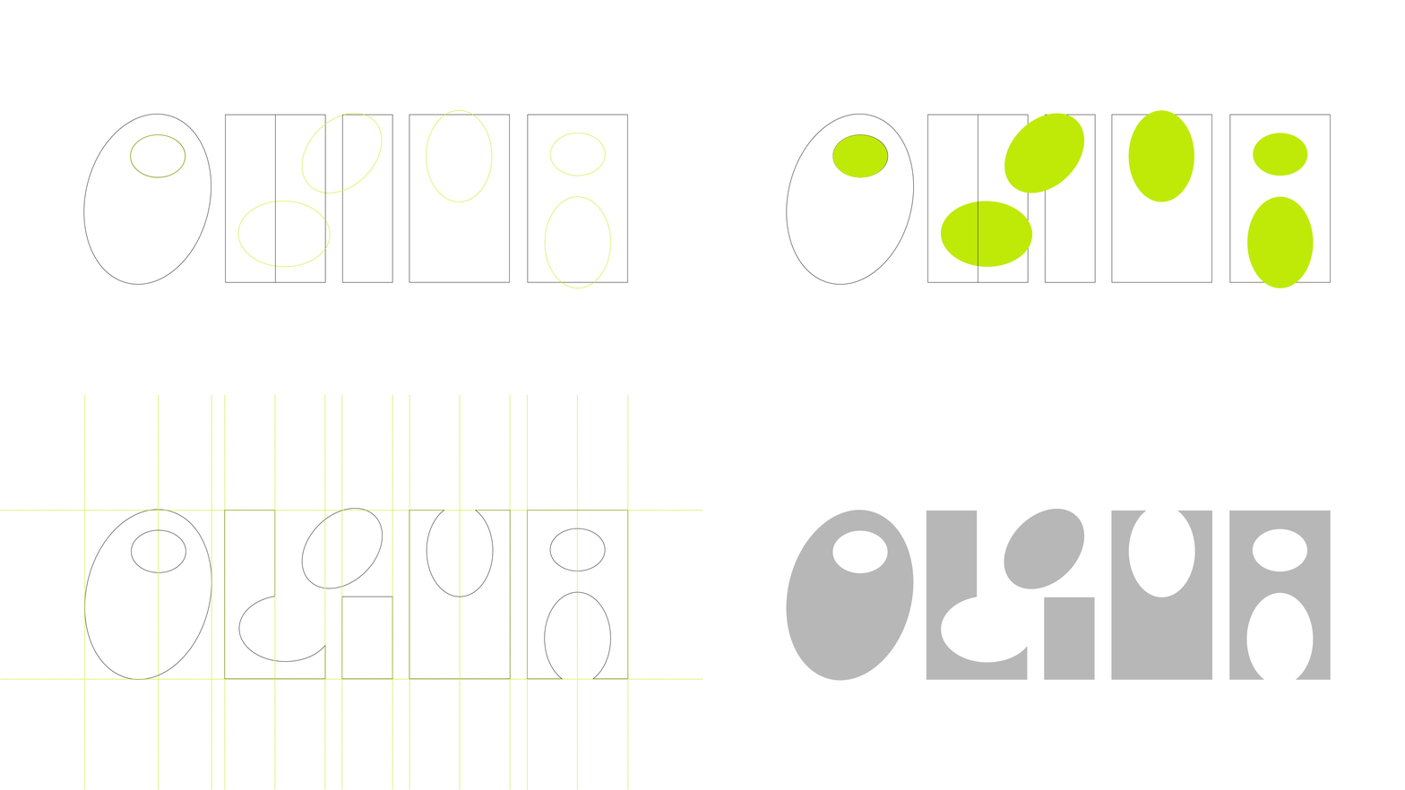
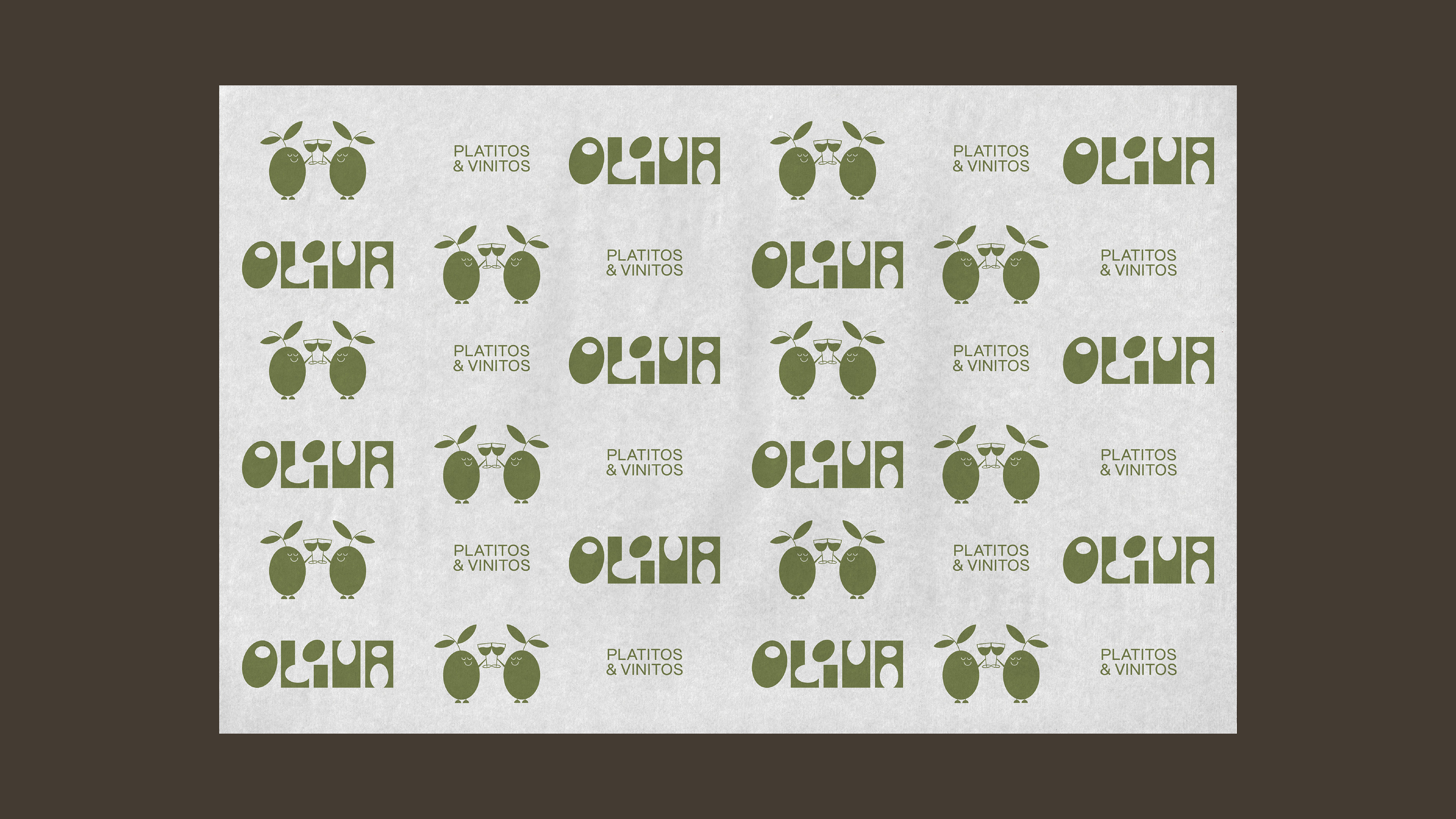
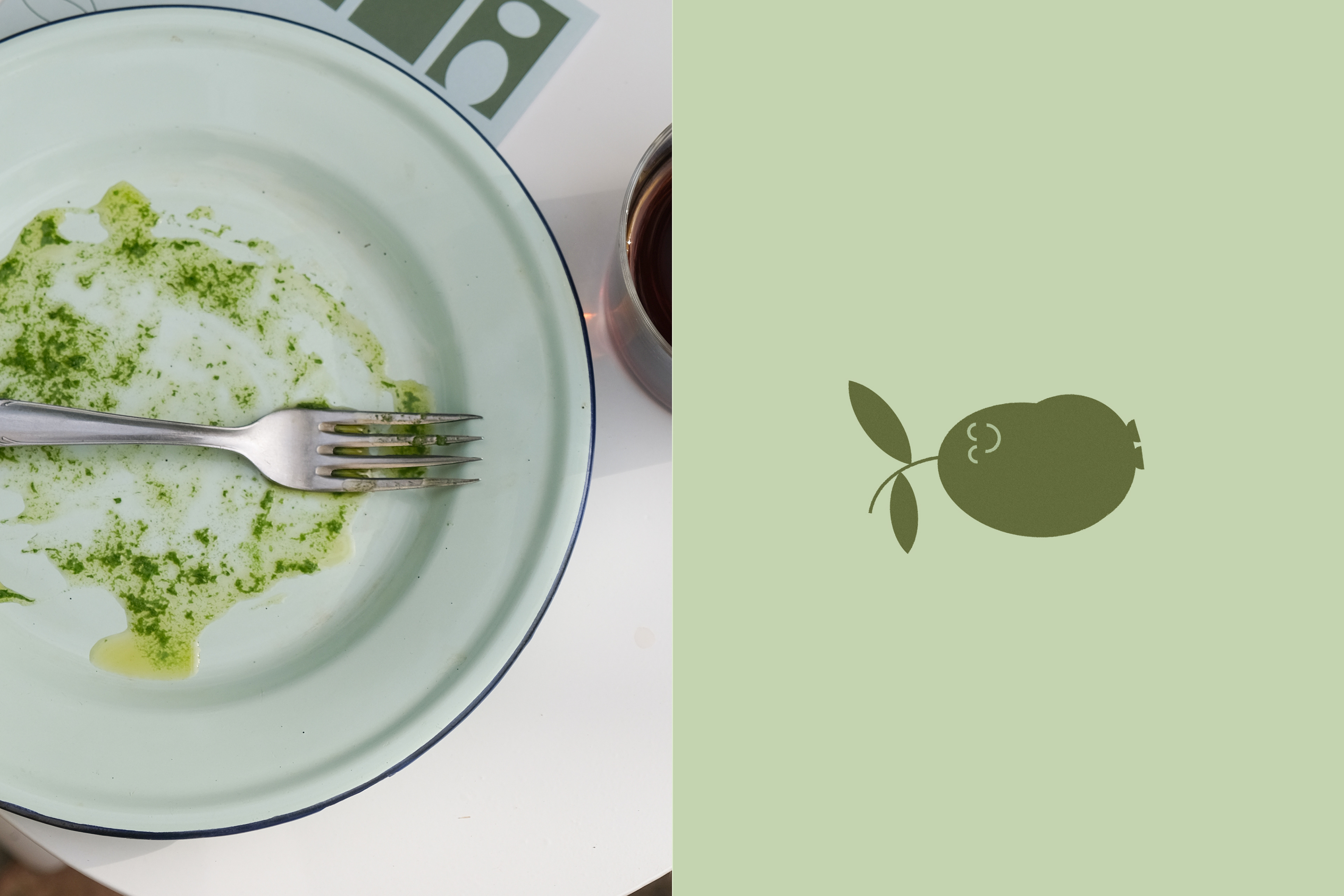
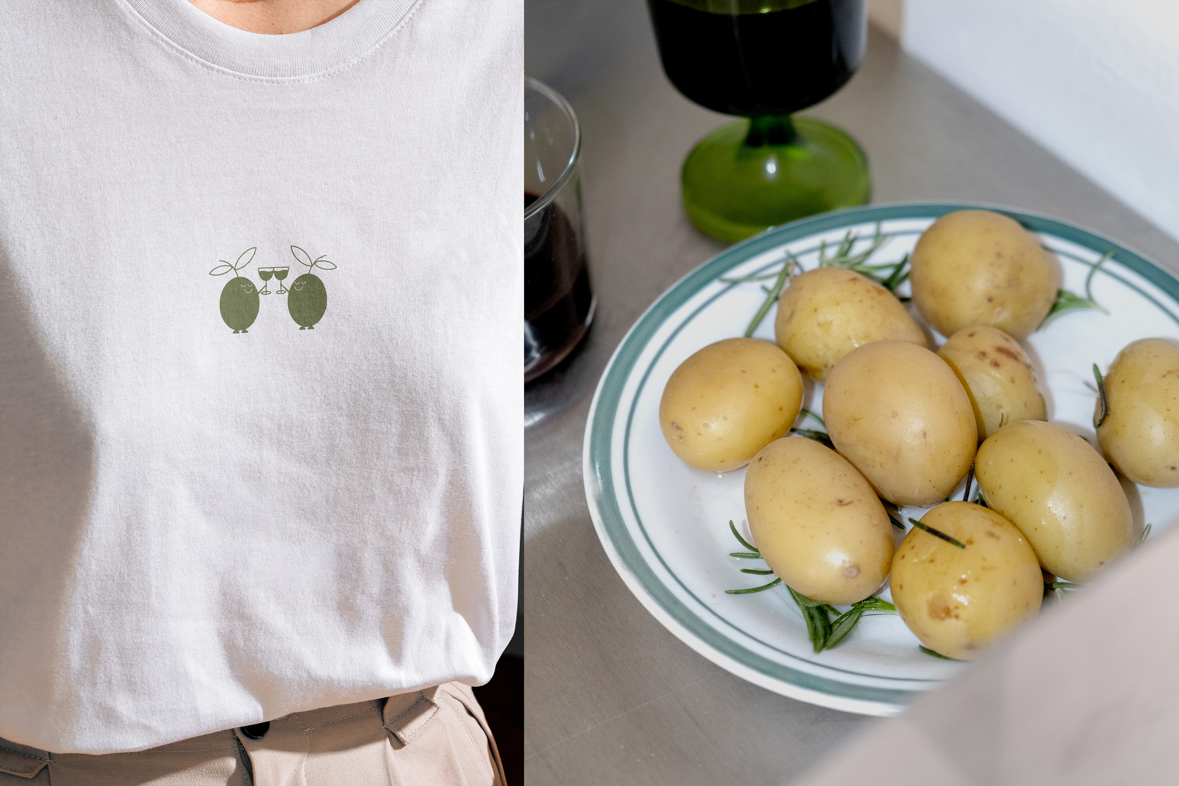
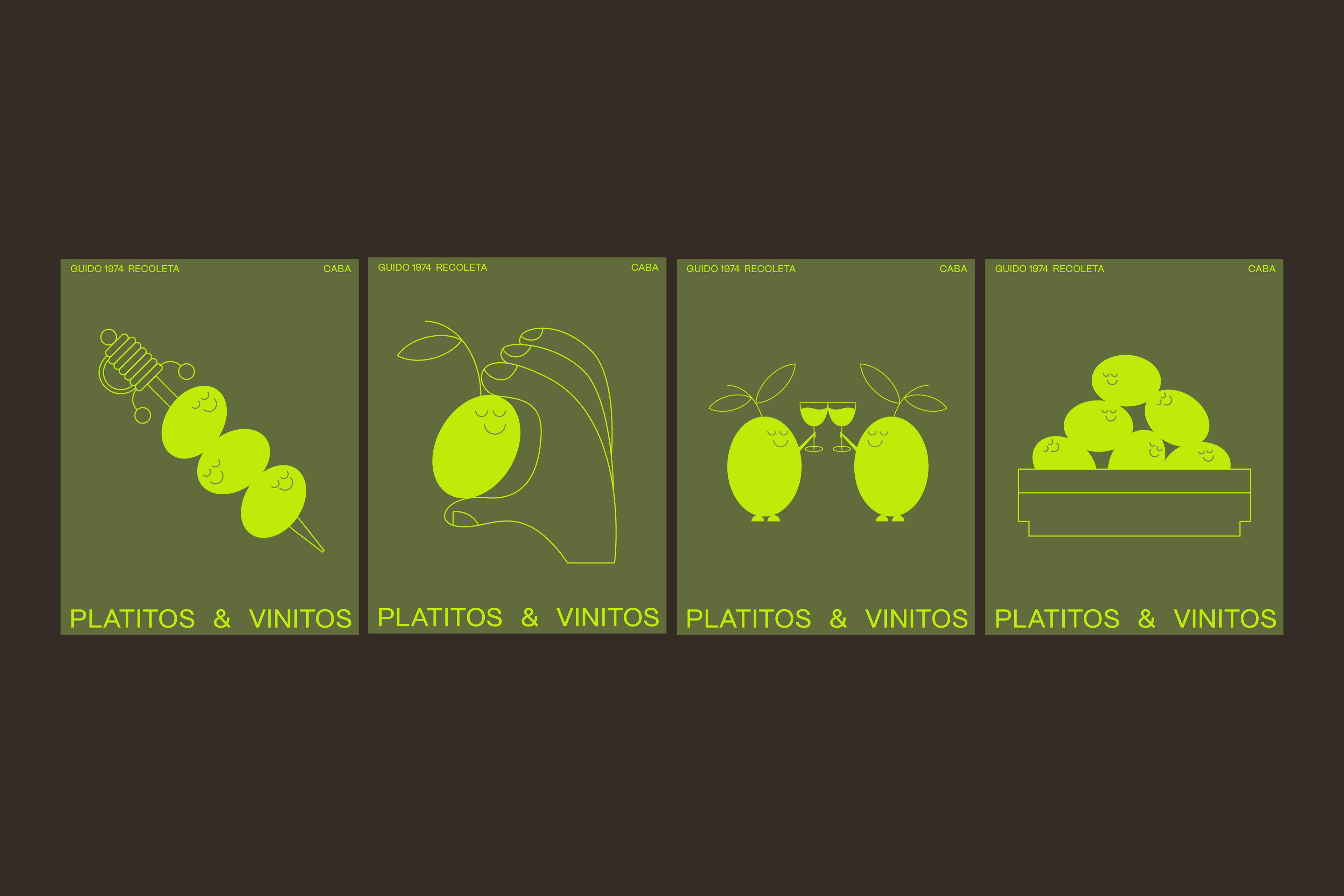
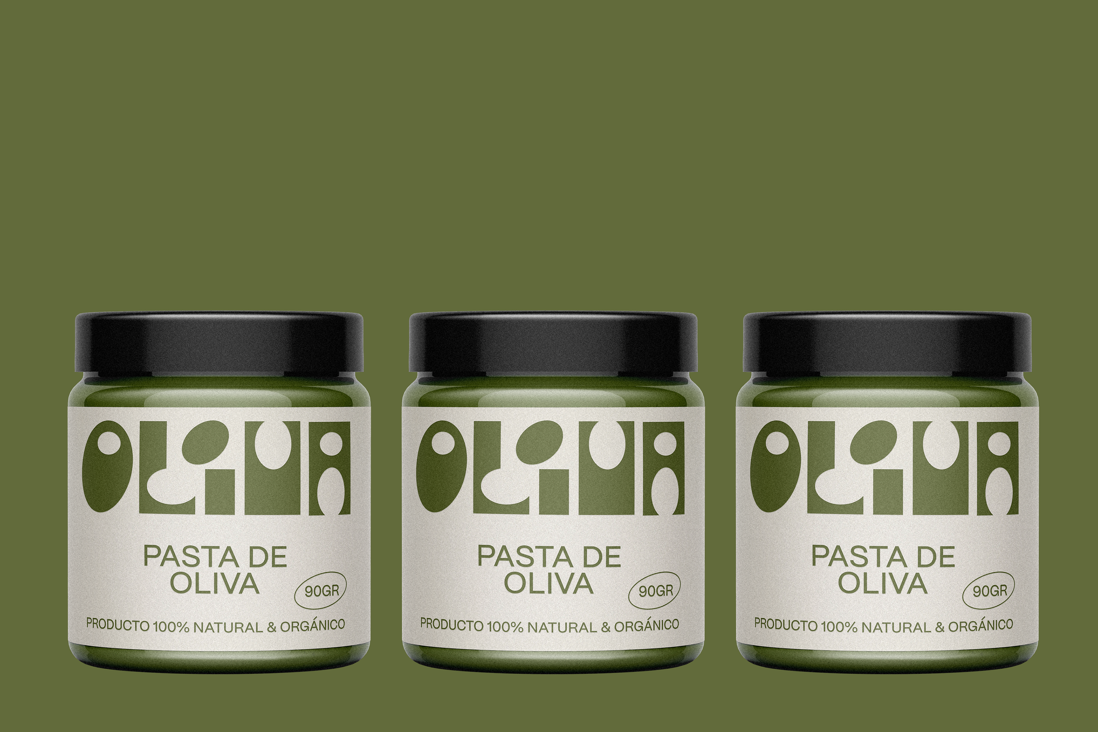
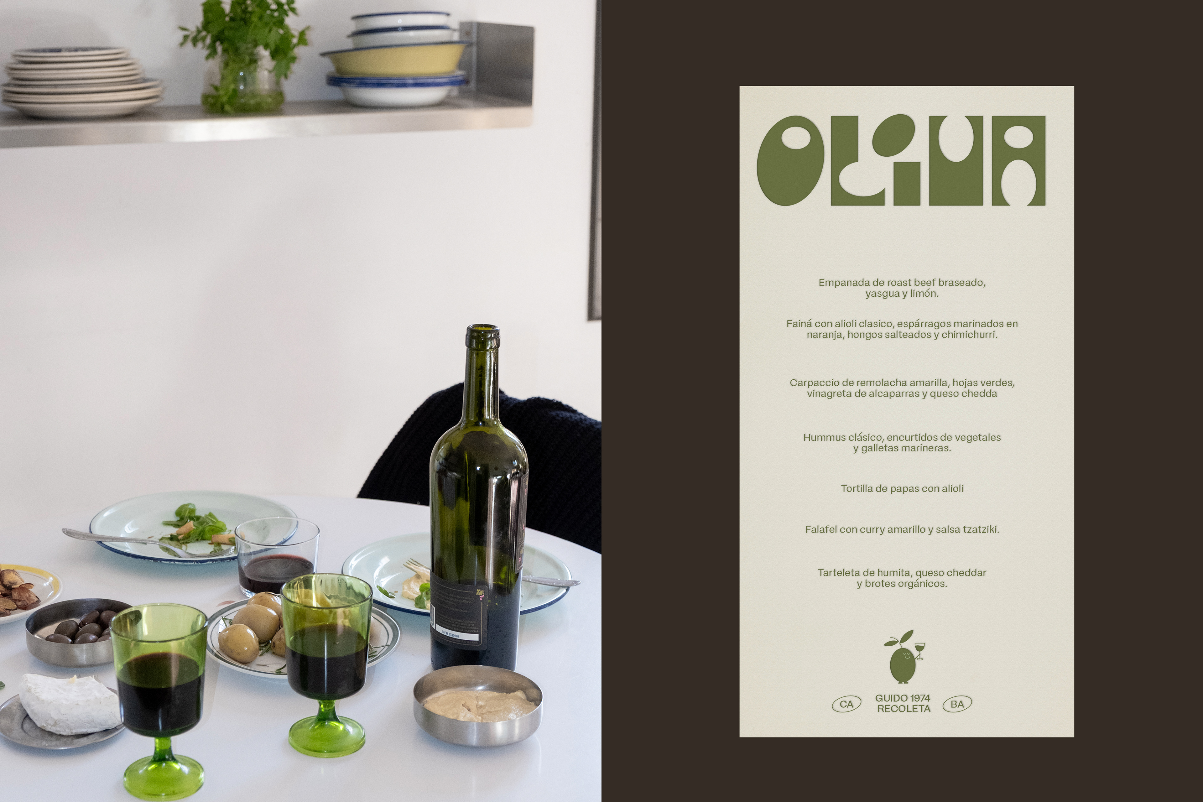
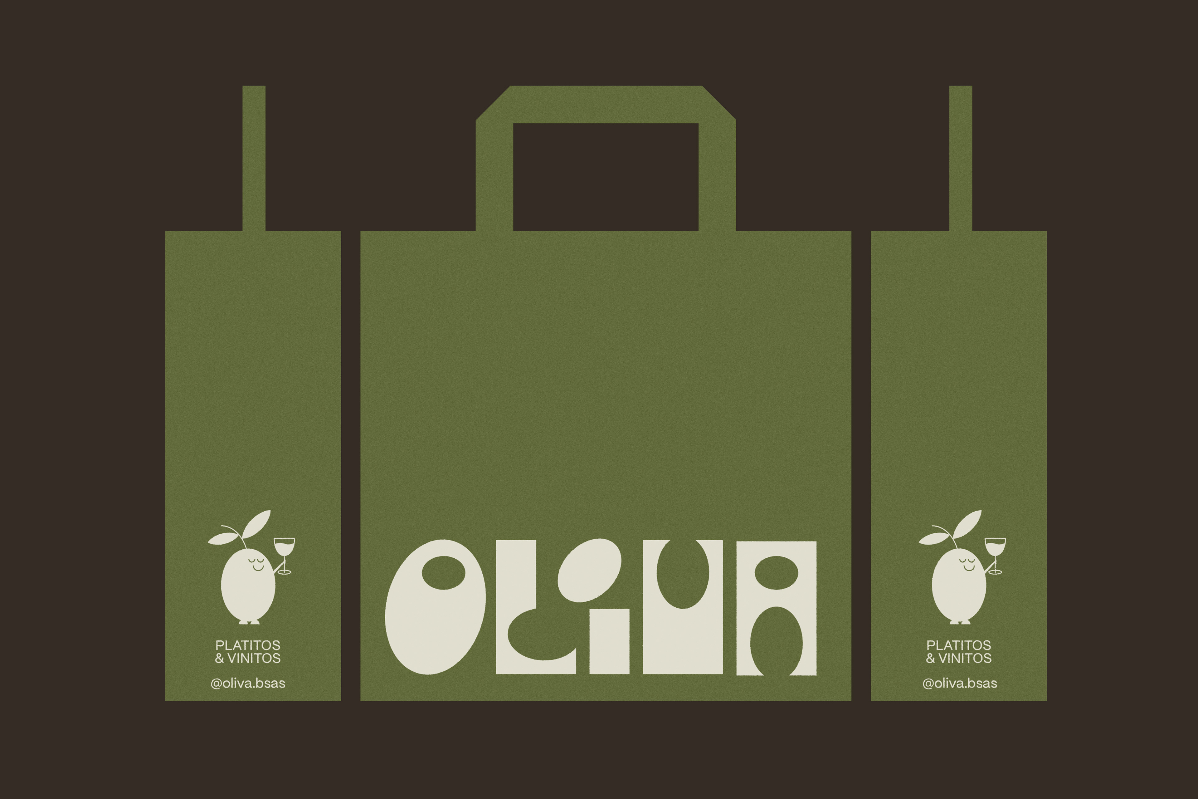
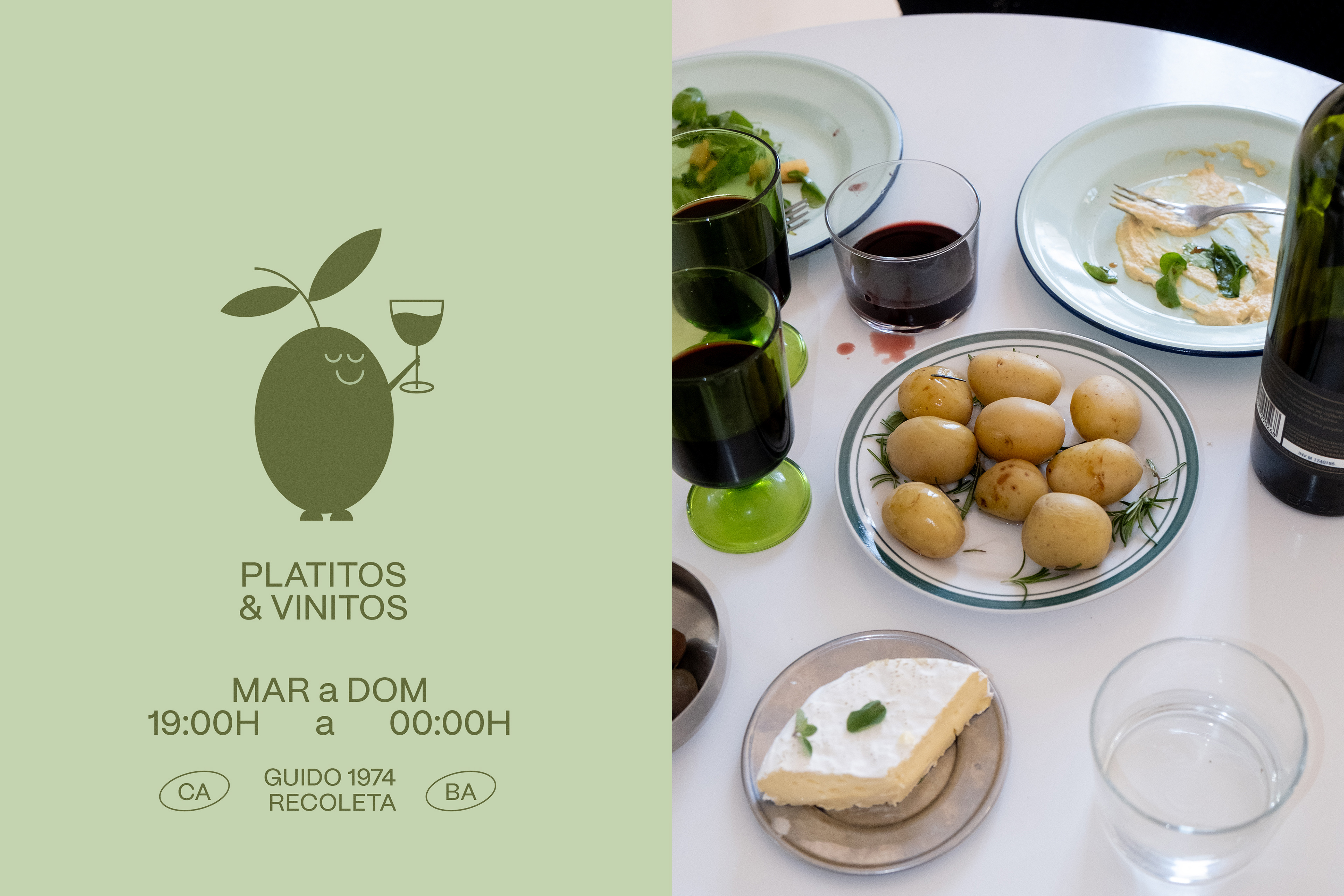
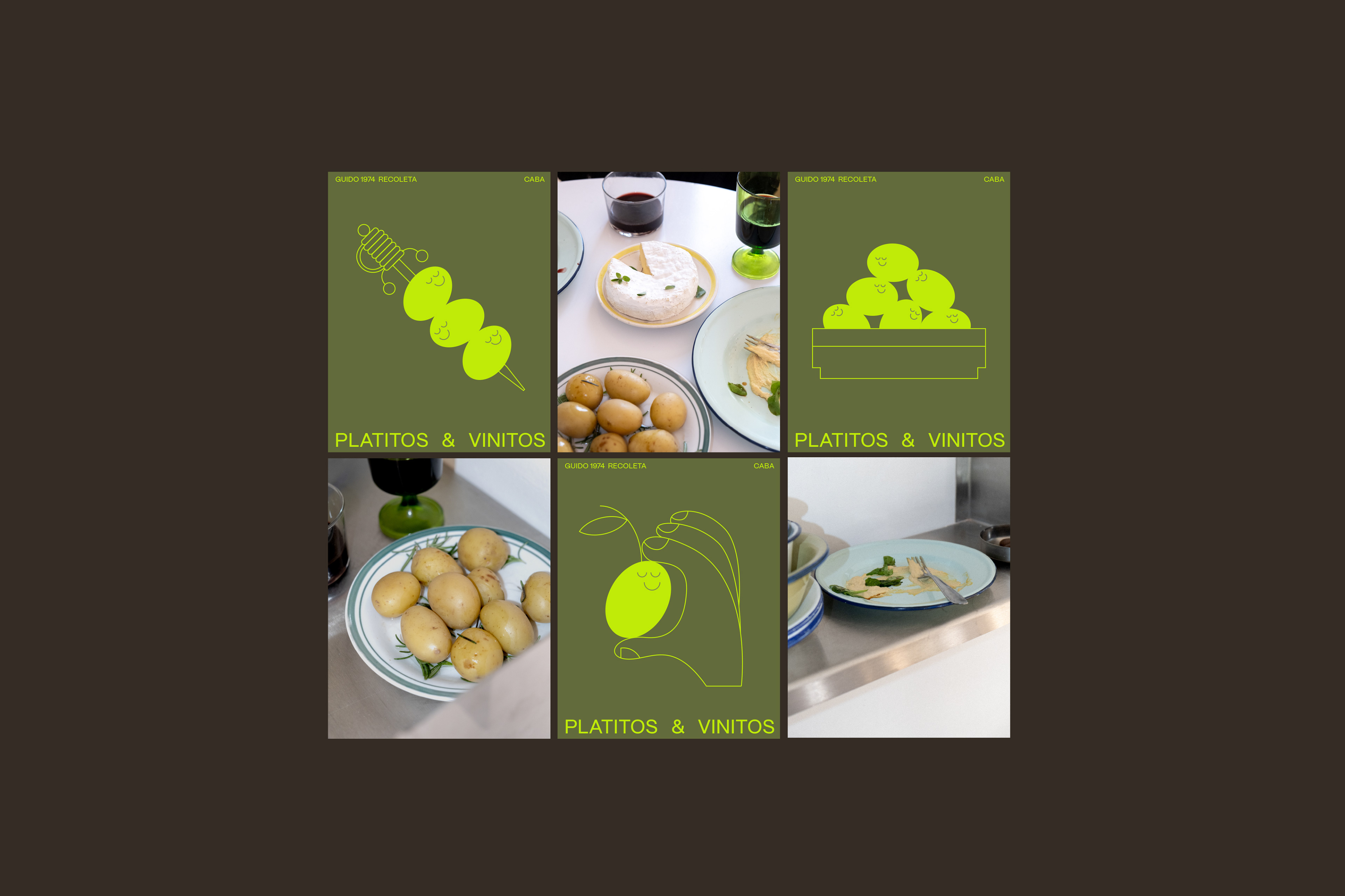
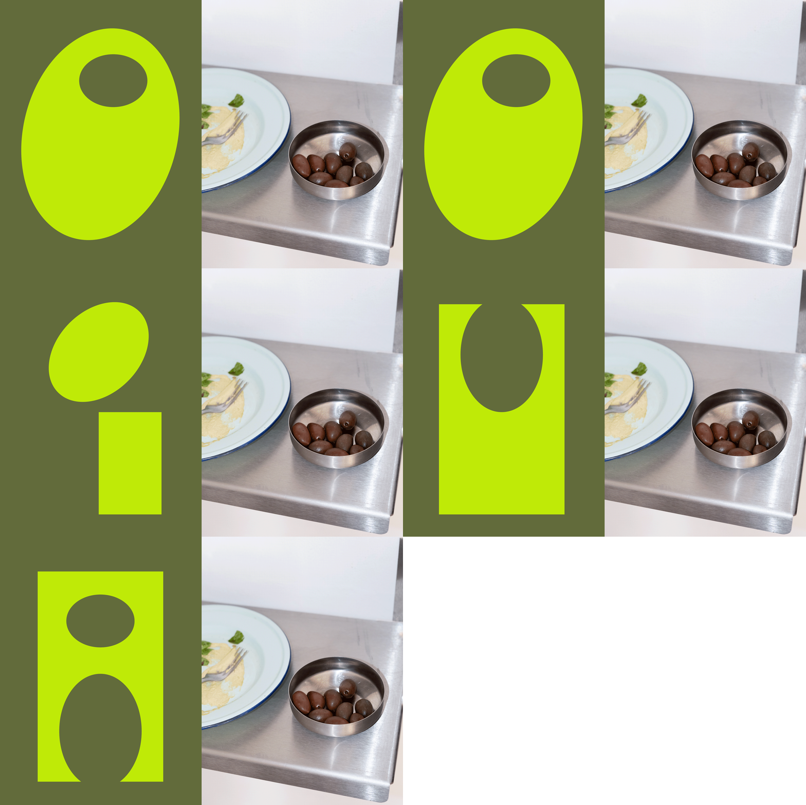
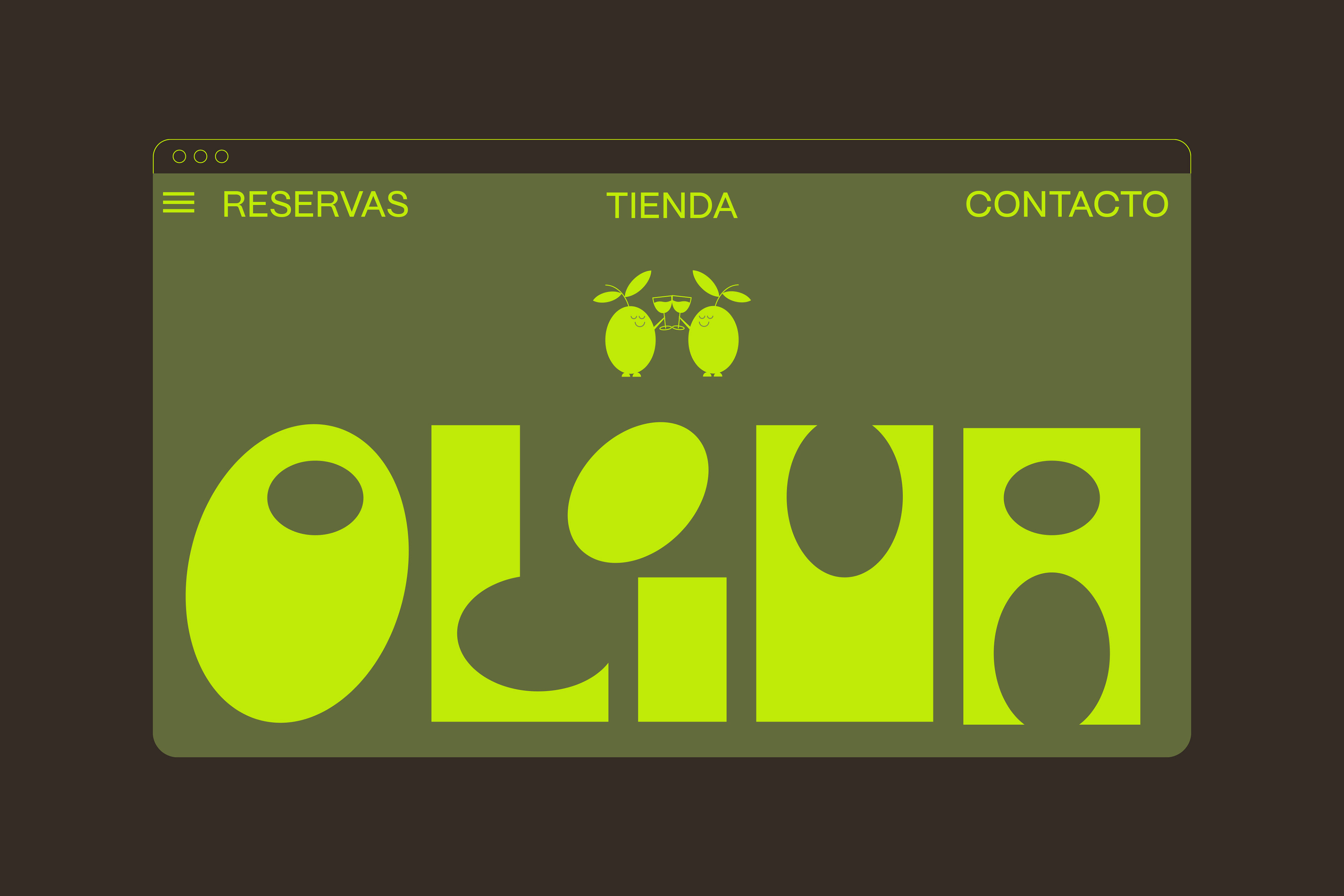
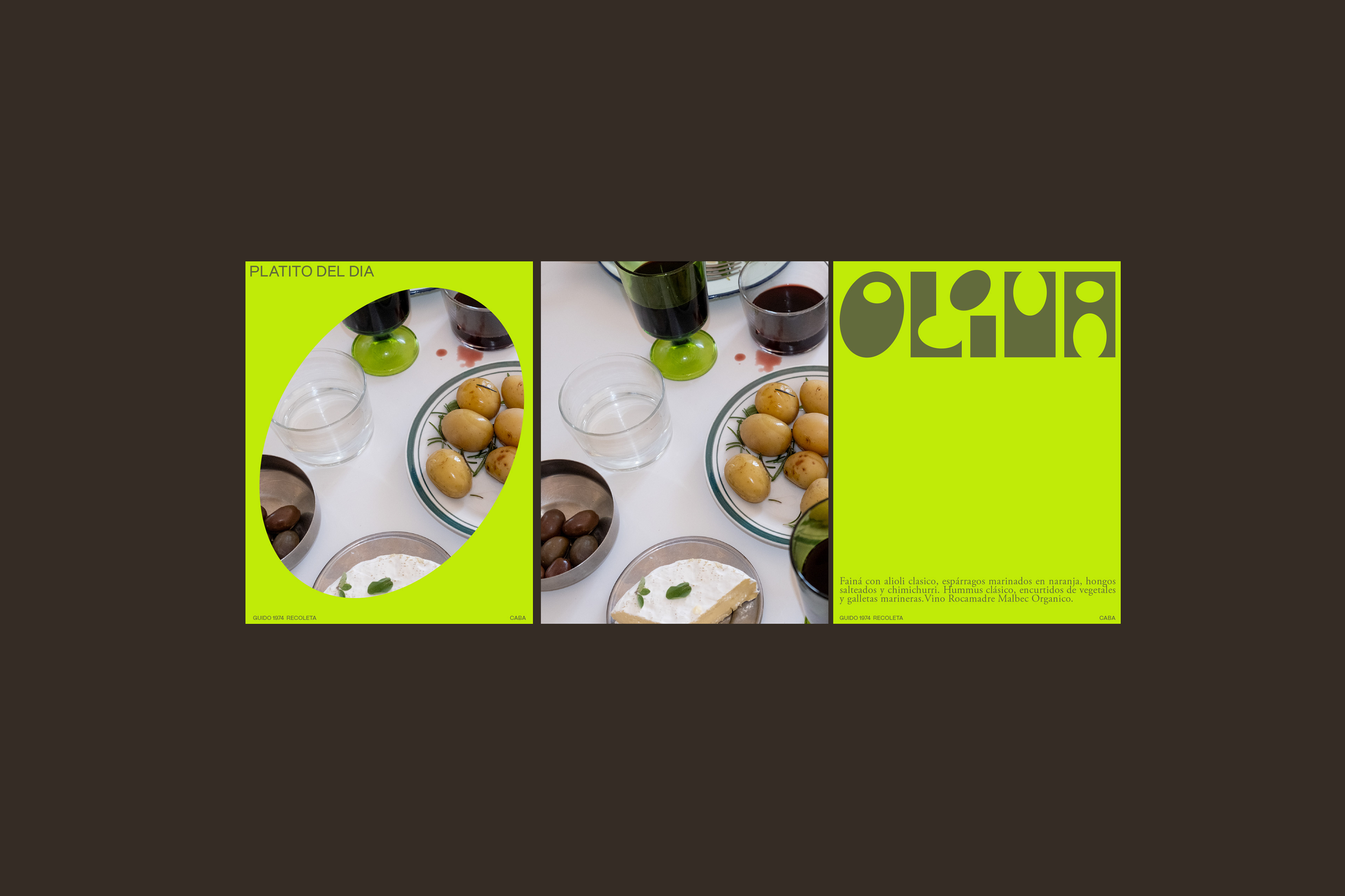
Identidad visual para un rincón de tapas y vinos en Recoleta. El objetivo fue crear una experiencia visual amigable y descontracturada, partiendo de una tipografía propia inspirada en la forma de las aceitunas. Para complementar el sistema, combinamos una paleta de verdes suaves con un acento vibrante, y diseñamos un set de personajes ilustrados que aportan calidez y dinamismo tanto al packaging como a la comunicación digital.
EN
Identidad visual para un rincón de tapas y vinos en Recoleta. El objetivo fue crear una experiencia visual amigable y descontracturada, partiendo de una tipografía propia inspirada en la forma de las aceitunas. Para complementar el sistema, combinamos una paleta de verdes suaves con un acento vibrante, y diseñamos un set de personajes ilustrados que aportan calidez y dinamismo tanto al packaging como a la comunicación digital.
EN
Brand identity for a tapas and wine spot in Recoleta. The goal was to build a warm, laid-back visual experience, starting with a custom typeface inspired by the shape of olives. To round out the identity, we paired soft green tones with a vibrant accent color and designed a set of illustrated characters that bring warmth and energy to both the packaging and digital touchpoints.